Spotify
What if discovery started with the moment you are in, rather than the catalogue?
Spotify is built around content you already have a name for — a playlist, an album, an artist, something you played last week. This explores a second way in: describe the moment instead, and have a session built around it. An independent exploration, not an official redesign, and nothing here shipped.
Drag the divider — or focus it and use the arrow keys.
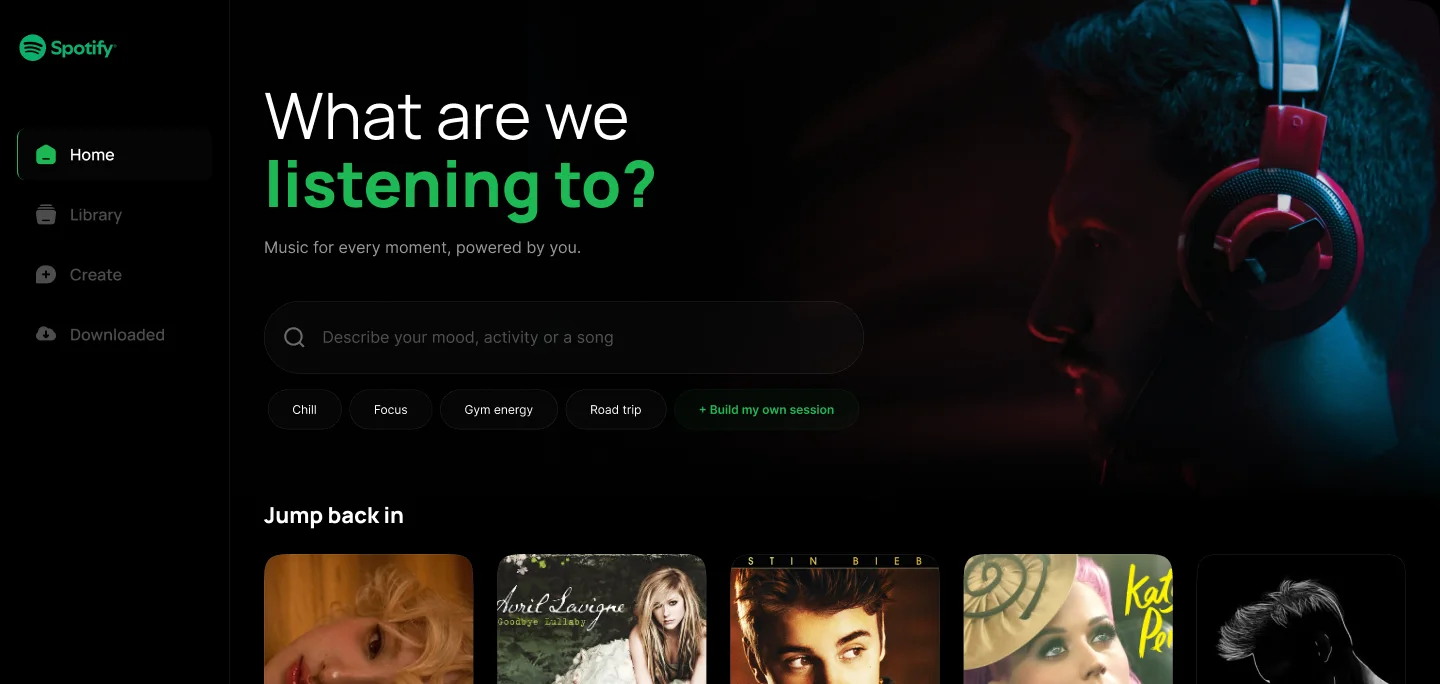
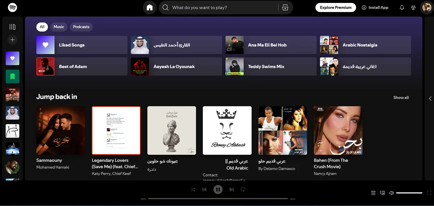 0% shows spotify today only, 100% shows my exploration only.
Context
Spotify's home is organised around things that already have names: playlists, albums, artists, recently played, and mixes built from all of it. That is an enormous amount of content and it works — as long as you can name what you want. The part I looked at is the first ten seconds, before you have named anything.
Why I looked at it
Because of how often I open it knowing exactly how I want to feel and not at all what I want to hear. The catalogue cannot answer that question, so I end up scrolling until something looks close enough. I wanted to see what it would take to ask the other question first.
What I changed
The home screen opens on a question — “What are we listening to?” — with a free-text field under it and four mood chips beside a fifth that opens the real thing: Build my own session. Everything Spotify already shows is still there, directly underneath. This is an additional door, not a replacement for the room.

Why
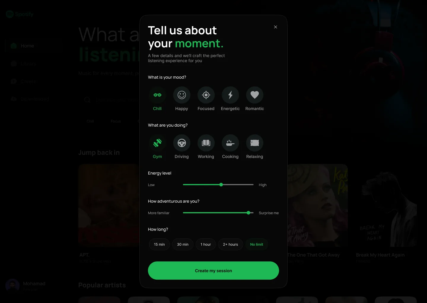
The inputs are about the listener, not about music. Not “which genre” but how you feel, what you are doing, how much energy you want, whether you want something familiar or something new, and how long you have. That is information a recommender can actually use and a person can actually answer — nobody knows what genre they are in the mood for, but everybody knows they are driving.
Why the result explains itself
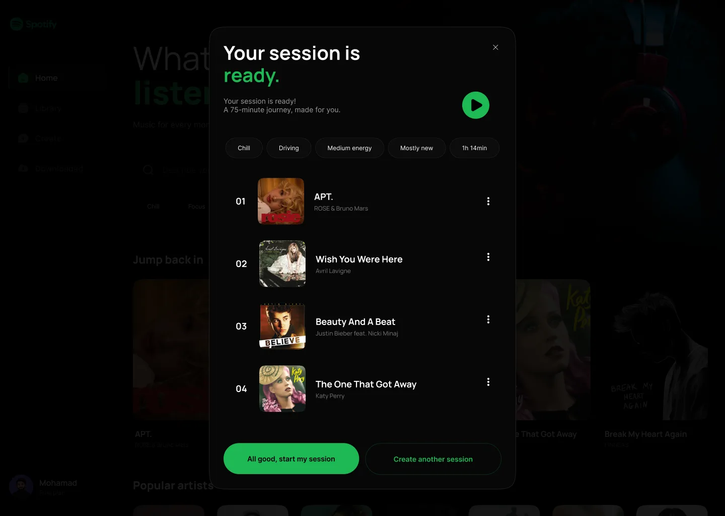
The finished session carries the five choices back as tags: Chill, Driving, Medium energy, Mostly new, 1h 14min. It is the smallest thing that stops a personalised result being a black box — you can see what produced it, and you can see which input to change when it is wrong.
How it works
Describe the moment
Five questions, all of them about the listener. Mood and activity are icons rather than a list to read; energy and adventurousness are sliders, because both are a position between two ends rather than a choice from a set; length is a row of chips ending in No limit. Structured inputs and a free-text field together, so it reads as describing something rather than filling in a form.
See what it made, and why
The session arrives with its inputs shown as tags and the first four tracks visible before anything plays. Two ways out: start it, or make another one. Showing the tracklist first is the part I care about — it is the moment you find out whether the thing understood you, and it costs nothing to look.
Listen to it as a session
A dedicated playing state rather than a return to the normal player — large artwork, the controls, and the context still visible. The session should feel like something that was assembled for this hour, and it stops feeling like that the moment it dissolves back into the same chrome as everything else.
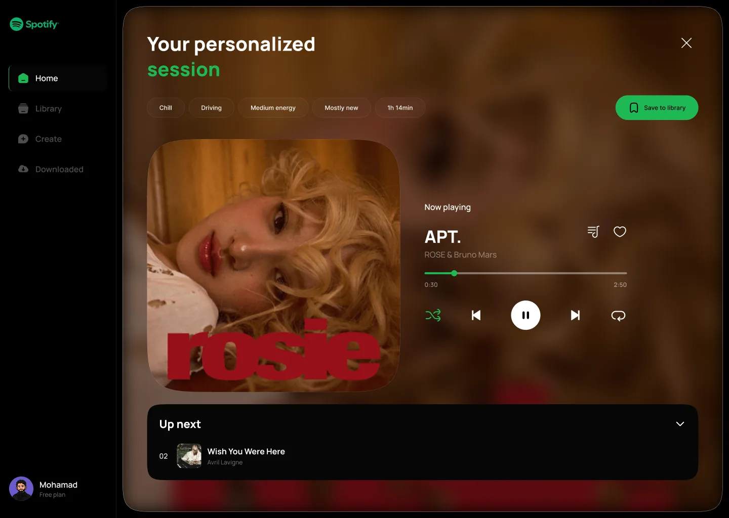
Keep the queue legible
Up next is given real room instead of being a panel you go looking for. If the pitch is that the sequence was deliberately assembled around your answers, then the sequence has to be the thing you can see.
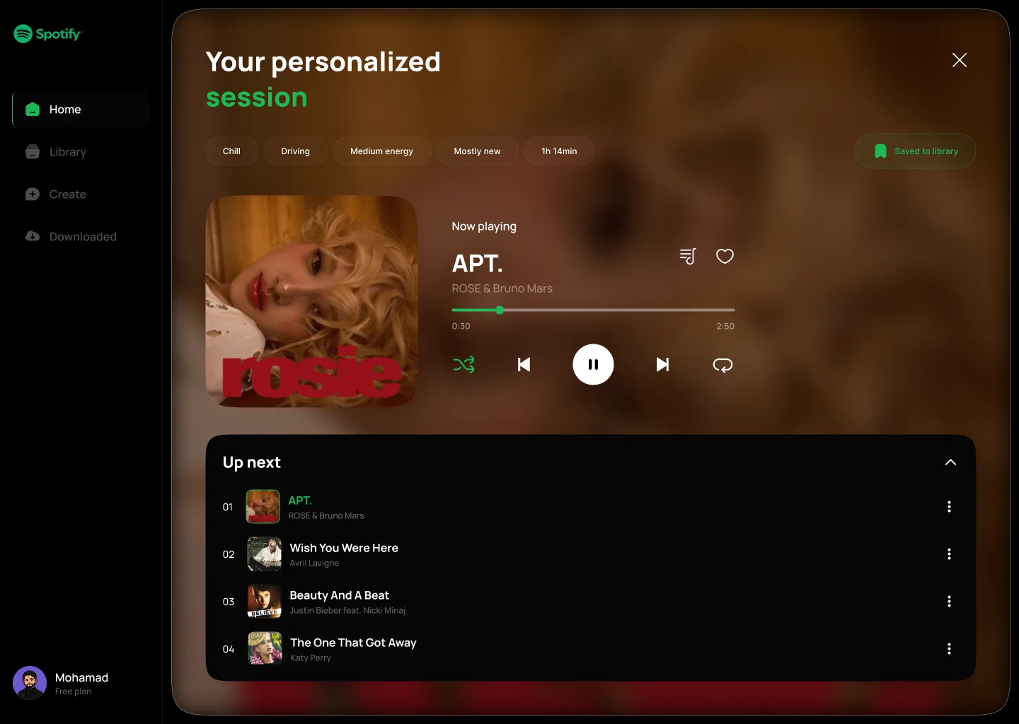
What I'd test
This was never built, so there is nothing to measure. What follows is what I would want to know before believing it.
- Does anyone understand what "Build my own session" will do before they press it?
- Is describing a moment actually faster than finding a playlist that already fits it?
- Do five inputs feel like being understood, or like being interviewed?
- Does "Mostly new" get moved, or does everyone leave it where it starts?
- Does the finished session feel different from a mix Spotify would have offered anyway?
- Would anyone come back to it a second week, or is it a thing you try once?
- Does showing the tracklist before playing build trust, or just add a step?

My take
An exploration is allowed to be half right, and saying which half is the point of writing it up.
- What I like
- The shift in who speaks first. Spotify opens with "here is what we have"; this opens with "tell me what this is for", and the five tags on the result keep that promise visible instead of asking you to trust it.
- What I'm not convinced by
- That it is five questions to avoid one scroll. The honest risk is that describing a moment is more work than recognising a playlist, and recognition is very fast — I have not shown that the trade is worth making, only that it is buildable. I am also not convinced the sliders earn their place over two more icon rows.
- Before I'd back it
- Whether anyone uses it twice. Everything else is detail: if the second session never gets created, the interaction model is wrong and no amount of tuning the inputs fixes that.