Club Expert+ — Phonak
A membership app for the hearing-care professionals in Phonak's Club Expert+ programme, gathering the news, training, product documents, and priority support they were chasing across other channels.
- Discipline
- Mobile app design
- Role
- UI / UX Design
Phonak's partner professionals already had the benefits of the Club Expert+ programme. What they did not have was one place to use them, so the material lived in inboxes, portals, and phone calls.
The app had to serve people who open it between patient appointments, on a shop floor, with a few minutes at most — and who are the reason the programme exists rather than its audience of last resort.
A membership programme is only worth as much as the speed at which a member can use it, and this one was spread across every channel except a single one.
Give each kind of content its own tab, make the documents scannable rather than beautiful, and keep the support line on screen at all times.
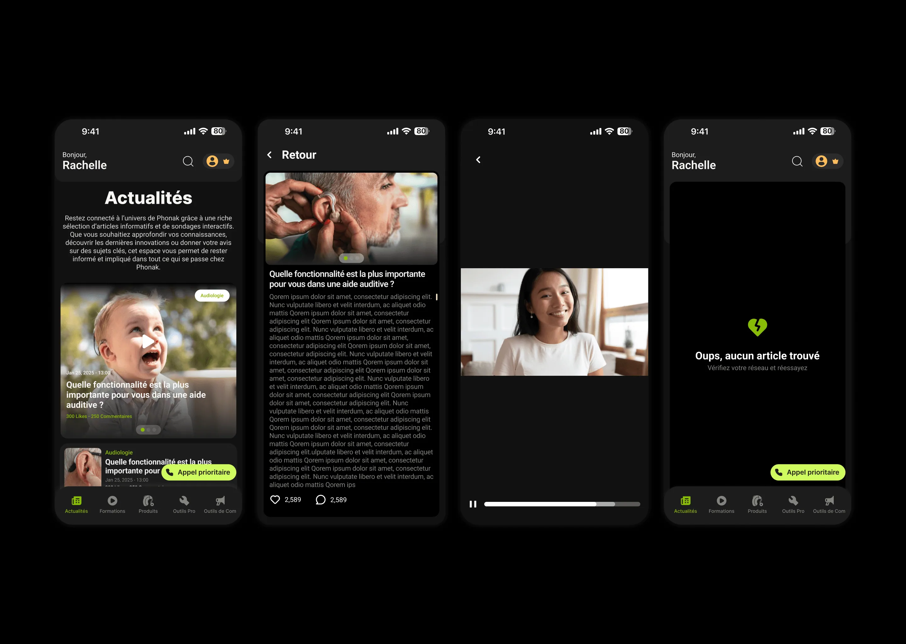
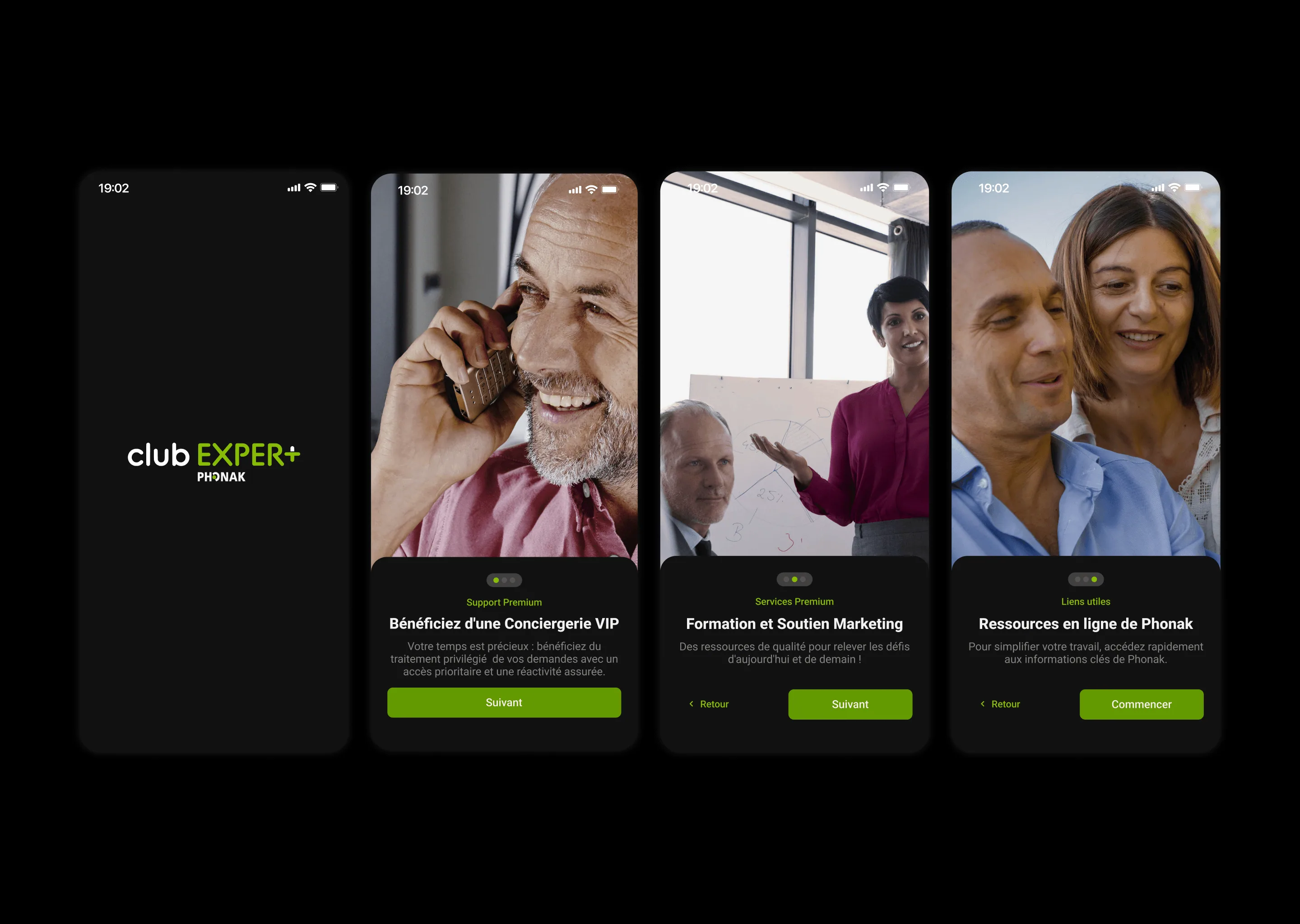
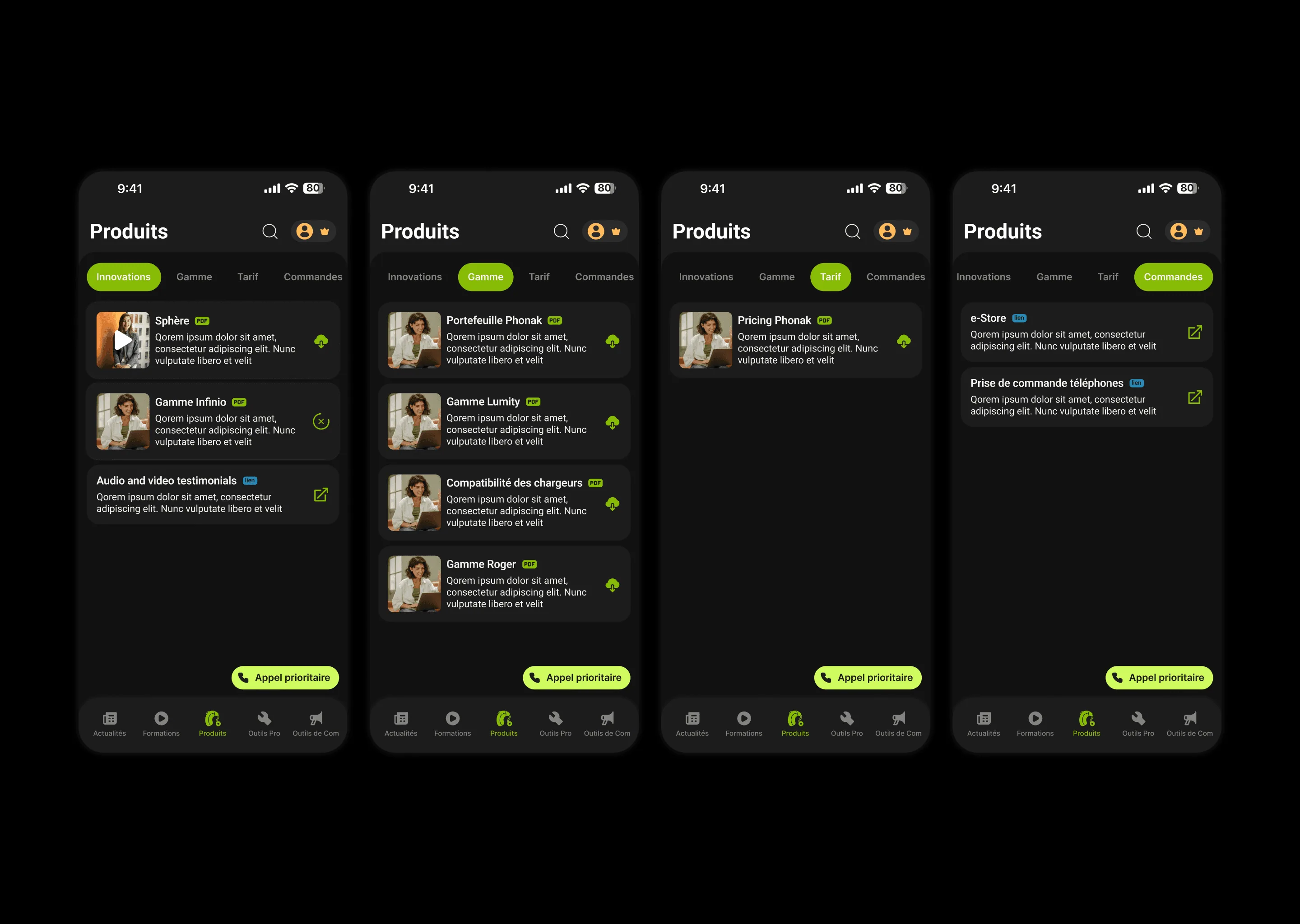
The five sections are peers in a bottom bar, so nothing is nested inside anything it does not belong to. Within Products, a second row of tabs separates innovations, range, pricing, and ordering — four questions a professional arrives with already formed, rather than four categories they have to browse. Document rows state their format and their action before anything else: a PDF badge, a download control, an external-link mark. Someone scanning for the price list should not have to open anything to find out what a row is. The priority call button floats above all of it, because the benefit people joined for should never be somewhere you have to navigate to. The onboarding does the one job onboarding can honestly do here — naming the three benefits before the member is dropped into a feed that assumes they know what the programme includes.
Each kind of content gets a tab of its own instead of being filed under a section it only half belongs to.
Format and action are visible before the title is read, so a document list can be scanned rather than opened.
The priority line floats over every screen, because it is the benefit the membership is actually sold on.
The screens a member actually opens.

Explore the design
Want to see the work beyond the screenshots? The real file is right here.
Figma design explorer
Ready for Figma source — Club Expert+ — Phonak
Development placeholder. Not rendered in production.
Design preview unavailable
The rest of this case study still is.
Most of this app is a list of documents, and pretending otherwise would have made it worse.
The useful work was in the rows rather than the flourishes: what a member can tell about a file before tapping it, and how few taps sit between opening the app and reaching the thing they came for. The part I would want to test with real members is the five-way split, which is a reasonable model of the programme but not yet a proven model of their day.