RM Luxury
A self-initiated redesign for a private-chauffeur and concierge service, working out how a quote-only offer sells itself with no prices to show. Concept work — never commissioned or built.
- Discipline
- Landing page redesign
- Role
- UI / UX Design
No client and no brief on this one. Chauffeur and concierge sites kept striking me as the same page every time — a lot of adjectives about discretion and excellence, and almost nothing a visitor can actually decide between — so I set myself the exercise of building one that sells the service without any of that.
Nothing here was commissioned by anyone, delivered to a team, or built. It is a personal study of a category I find badly served.
A service with no published prices and no availability calendar has nothing concrete to put on a page, which is why so many of them fall back on adjectives.
Let the fleet and the occasions do the explaining, and treat the quote as the product rather than as a fallback.
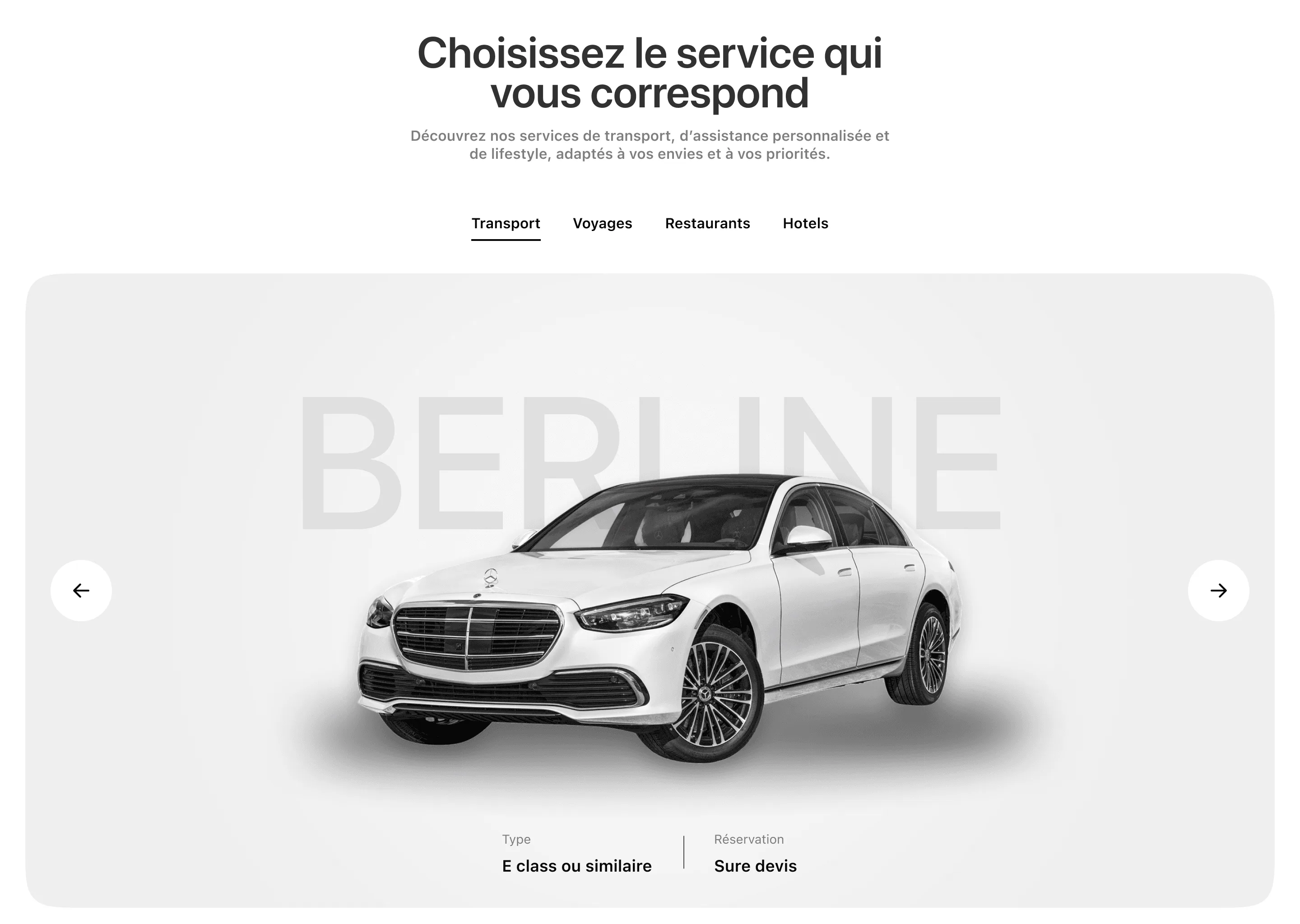
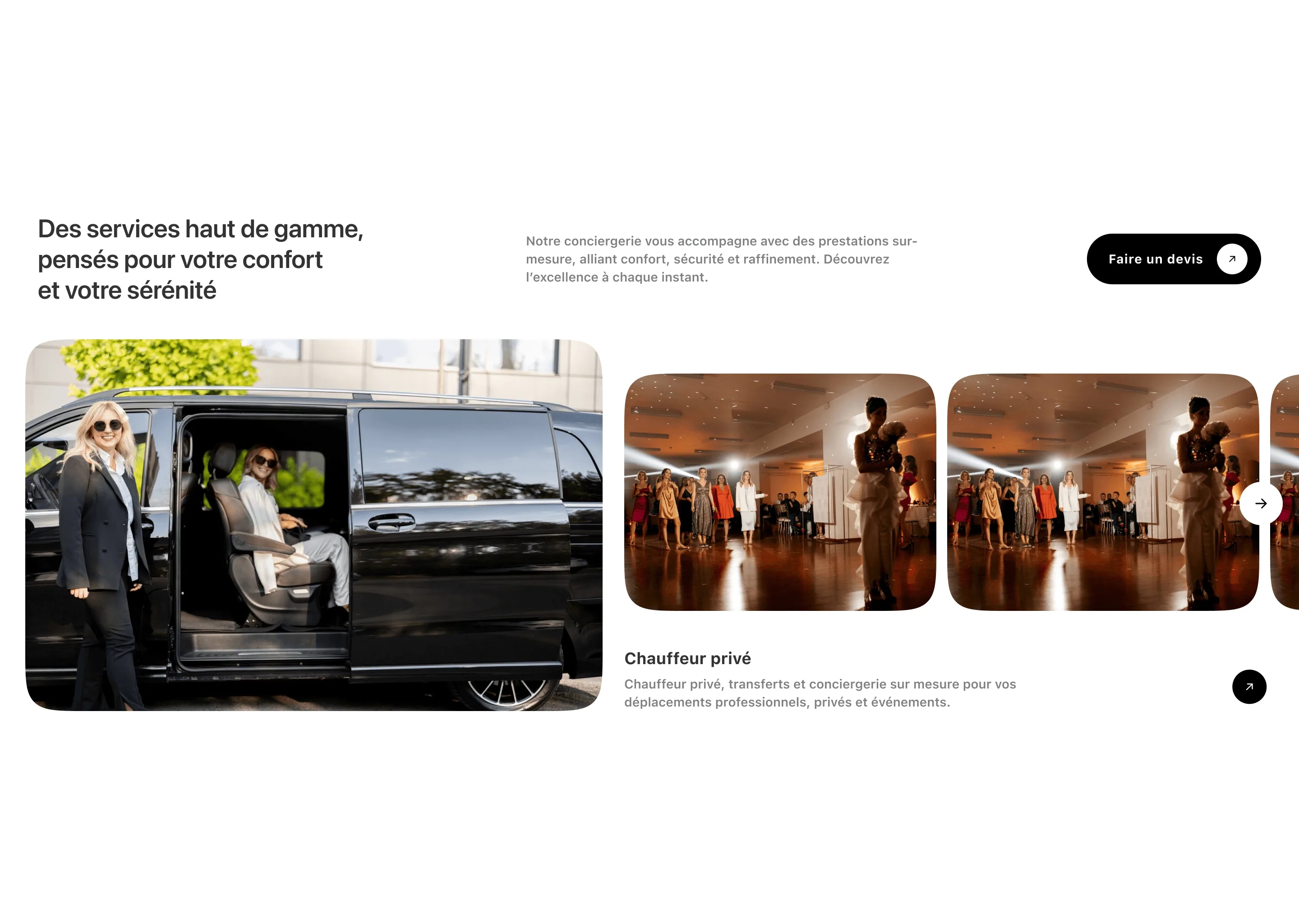
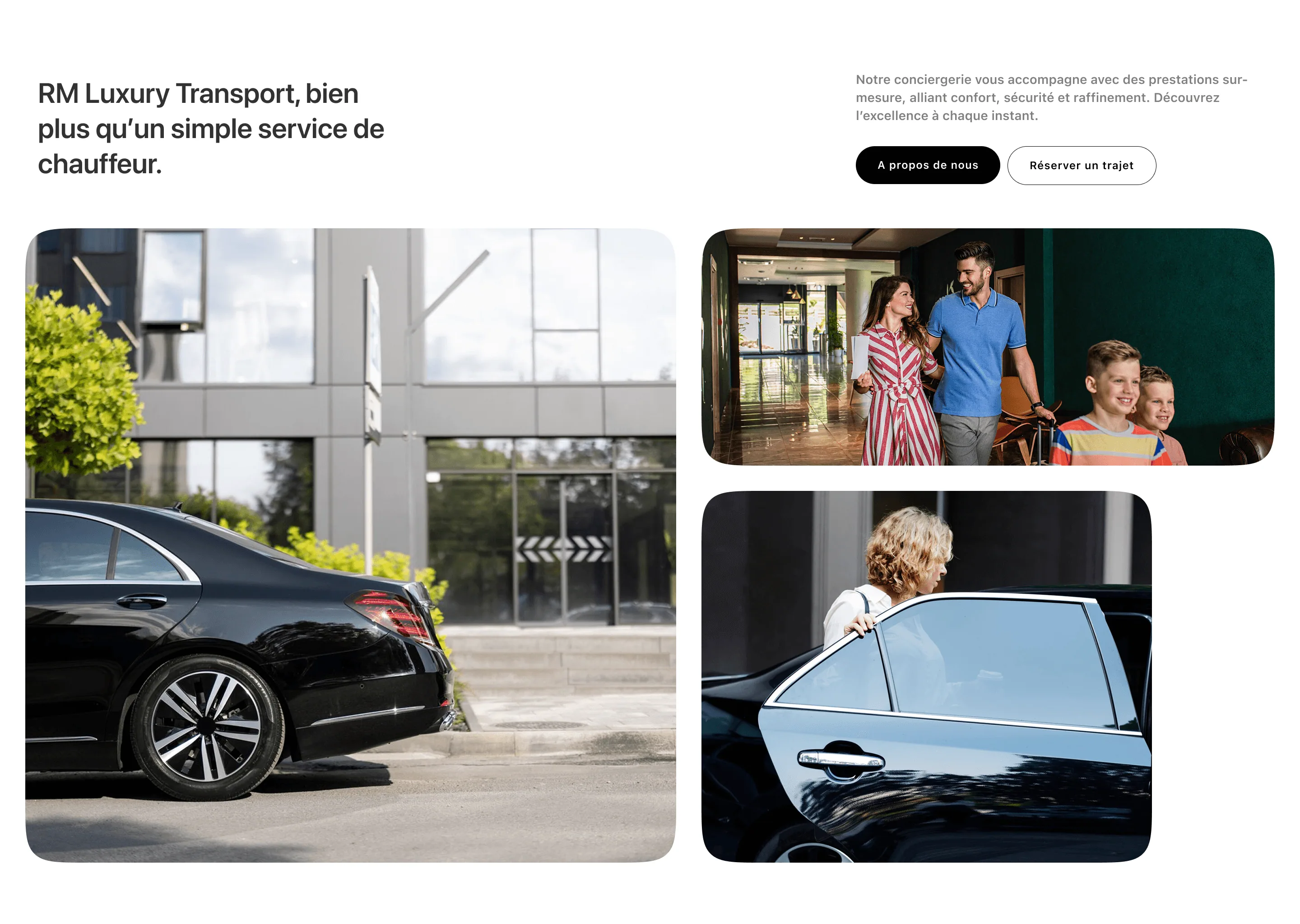
The service picker puts the four offers behind one set of tabs so the site can be broad without the home page having to be. Inside Transport, each vehicle gets the full width and a single specification line — the class and the fact that reservation is on quotation — because those are the two things a visitor is actually deciding between. The rest is photography doing work the copy cannot. Where a competitor would write about discretion, this shows a driver holding a door, a family arriving at a hotel, a room set for an event. Type stays quiet and black on white so nothing competes with it.
Transport, travel, restaurants, and hotels share a single tabbed surface instead of four competing sections.
Every route ends at the same enquiry, stated plainly on the card rather than hidden behind a price nobody can publish.
The standard of the service is shown in the images so the copy never has to claim it.
The pages that carry the offer.

Explore the design
Want to see the work beyond the screenshots? The real file is right here.
Figma design explorer
Ready for Figma source — RM Luxury
Development placeholder. Not rendered in production.
Design preview unavailable
The rest of this case study still is.
Redesigning a category rather than a product means the brief is entirely mine, which makes it easy to solve a problem nobody has.
The discipline I set myself was to remove a claim every time I wanted to add one, and let the fleet, the occasions, and a very plain type treatment carry the positioning instead. Whether that actually converts better than the adjectives is exactly the thing a self-initiated concept cannot tell you — it would need a real operator, real enquiries, and something to compare against.